TSUNAMI
Summary
CLIENT
University of Texas at Arlington | Visual Identity | Summer 2020
Problem to Solve
Create an interesting logo for a sushi restaurant set in Japan called Tsunami.
Creative SOLUTION
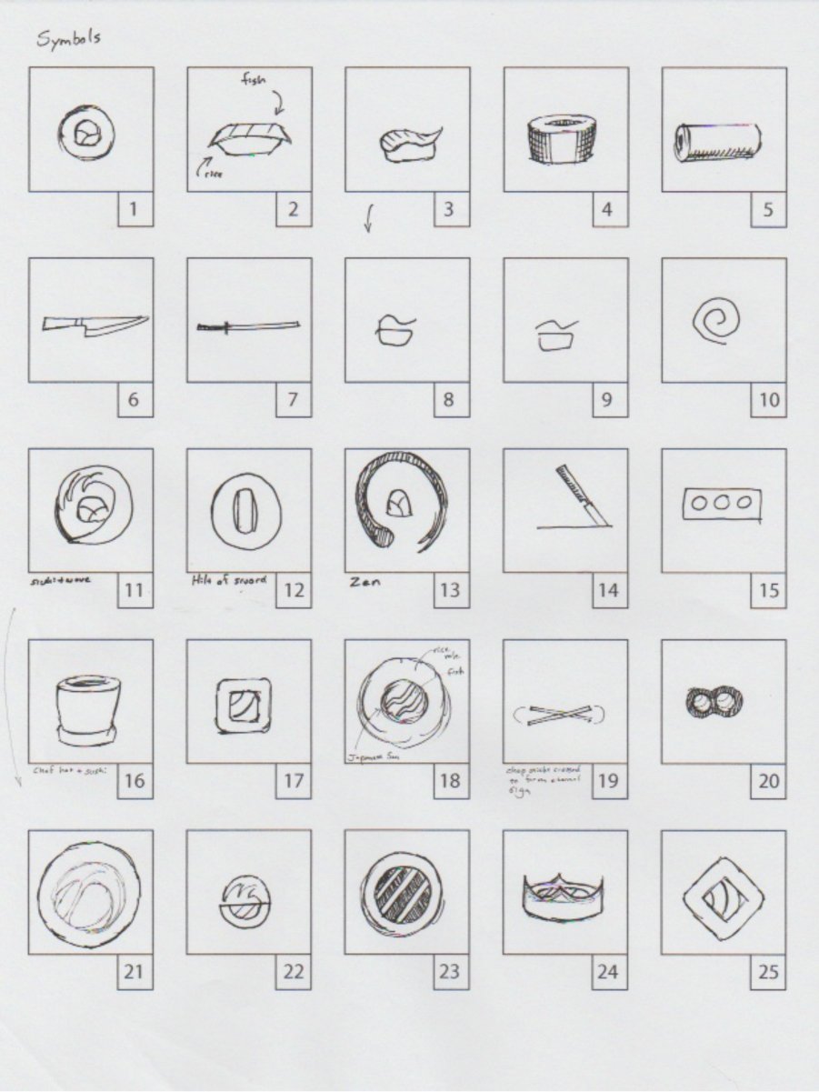
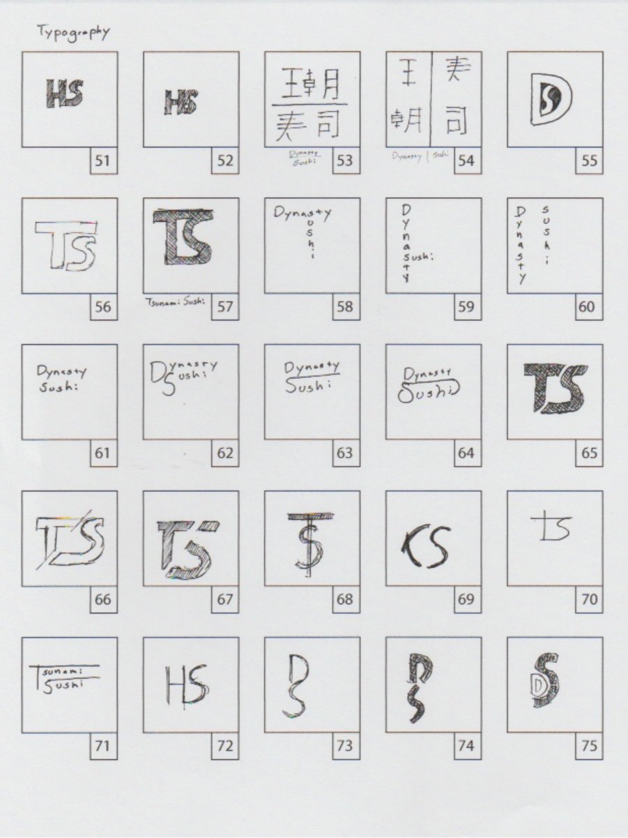
I started by deep diving into Japanese sushi history to better understand what role sushi plays in their lives and culture. I watched a documentary and read articles on the trade which lead me to discover that the occupation of a sushi chef is a very honorable trade. Thus, I wanted the logo to be elegant, serious, and respectful of this revered occupation. I then started researching what designers had already done for sushi restaurants in the past in order to be able to set my logo apart from the competition. After settling on a thumbnail sketch I liked, I moved into digital production.
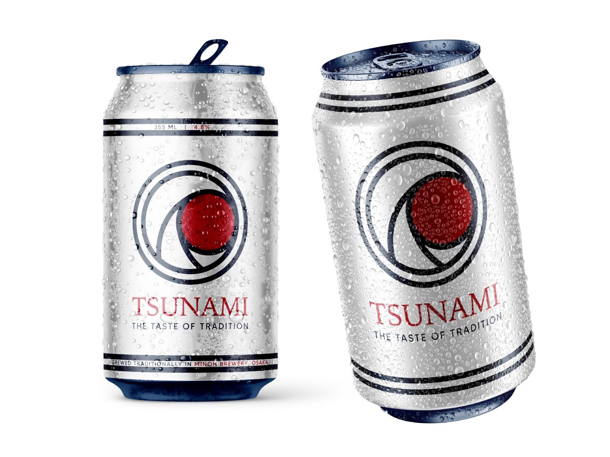
I created a geometrically balanced logo rich with symbolism that reflected the history of Japanese culture. At first glance the logo looks like a typical piece of sushi, but upon further inspection the viewer will discover 3 items hidden within. The crimson-red circle in the center is from the Japanese flag which represents its nation and people. There is also a wave wrapping around the circle that is a reference to one of Japan’s most well known works of art globally, The Great Wave by the Japanese ukiyo-e artist Hokusai. Finally, the ring around the other two items ties this mark into a Japanese signature known as a hanko.
Applications


Process


Inspiration

Hanko Chop

Applied stamp

The Great Wave off Kanagawa by Hokusai, 1831

Japanese national flag

